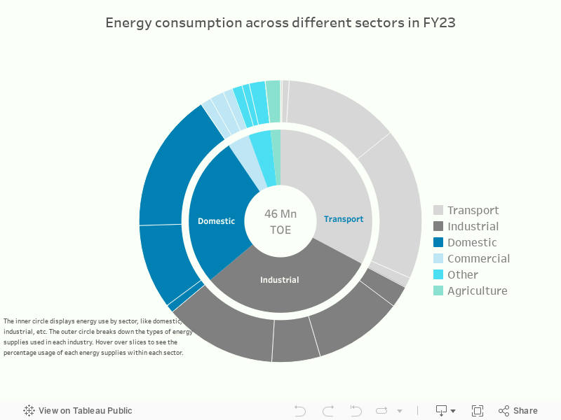
Energy consumption: A sectoral breakdown
The following sunburst charts illustrate the sector-wise share of energy consumption. The inner circle represents energy use across sectors, including domestic, industrial, and transport, while the outer circle highlights the types of energy supplies utilized by each sector. Hover over each slice for further insights into energy consumption patterns.